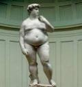
 How often do kids get a chance to merge art history, anti-junk food messaging and viral ‘forward to a friend’ fare in one big yuck-fest of ‘ewww?’
The e-mail caption accompanying the photo at left? “After a short stay in America, Michelangelo’s David returned to Europe as McDavid.” Glad I didn’t spew my morning coffee…Some may scold me that it’s ‘no laughing matter’ as just yesterday I was talking about the life altering impact of morbid obesity on this generation of kids, but as far as I’m concerned, hilarious video spoofs, “internet people” and irreverence all go hand in hand.
Pop culture critiques that ‘go viral’ are “gold” to me, because it’s meaningful media that’s both fun and effective.
Just look at our coverage of teen ‘forwarding faves’ like the Meatrix, Store Wars, Backwards Hamburger and others; if it makes a strong point that can influence action, then to me, it’s a winner!
Visuals like these open useful conversations that go far beyond body image, obesity, and the academic spectrum where some kids may not even recognize the joke due to art funding cutbacks…They can make data click in kids’ brains fast, and be used as a demo on most any topic d’jour…Today’s is “portion distortion.”
This portion distortion quiz gives you a quick take on how fast we’ve shifted in ‘calories per portion’ over the last 20 years. It’s stunning. (Visual credit at left from The Health Today Show blog which has a succinct ‘what is a portion’ wrap up)
As our own nutrition guru, Rebecca Scritchfield writes in her portion distortion article, this confusion over ‘calories and serving size’ is getting people tweaked. (those little ‘100 calorie packs’ are still empty calories if it’s non-nutrient empty junk, ya know?)
To me, this demonstrably contributes to the downfall of kids’ perceptions of reality when it comes to ‘what IS a serving size?’
As I write this, I’m chomping a little pouch of trail mix, and as I flip over the back it reads: 160 calories, 90 from fat, which makes sense as it’s full of nuts, raisins and healthy protein…
Then I squint at the trail mix fine print: “servings per container, ‘about three.’
Huh? Say what? You mean in this tiny 3 oz. bag?! Yowza, that’s almost 500 calories in my hand…albeit healthy ones.
We mirror this label lingo issue in our media literacy with kids so they see how they’re duped into thinking a ‘serving’ of those neon toxic chem cuisine ‘Flamin’ Hot Cheetos’ is a full bag if they don’t read the label right.
Good ol’ Chester Cheetah…part of the elaborate ‘orange underground’…(my, my, how did I miss that campaign?) Anyway, kids get a wake up call finding those nasty beasties are actually THREE “servings” with THREE times the sodium and additive empty calorie crud…(but hey, they’ll probably pass some ‘reformed nutrition guidelines’ coming out with a baked version of the chem cuisine…eh? We deconstruct what’s in ’em, get those ‘eww’ moments going, and all in all have a great deal of fun making change as much as we can. (we try to do the ‘switch pitch’ and swap it out for Pirate’s Booty as a healthier alternative) but as we all know, we’re still talking ‘snacks’ vs. whole foods, but it’s ‘baby steps’ that are doable…
Portion wise, the sports drinks, energy drinks, and other ‘Super-Sized’ gargantuan sizes all ‘look ok’ to kids at first glance minus the math/multiplication details, which we all know most kids will miss.
Frankly, they’re right back up to the chugging ‘soda’ category when you add the sodium, sugar, additives and artificial dyes…even worse, because kids think they’re ‘healthier’ and ‘okay’ to slam back a few. Eesh.
 Of course, the mega-marketing nightmares like muffins the size of a head of lettuce, salads the size of a small garden, ‘footlong’ deli sandwiches and that gross ‘Quad-stacker’ resembling a heart attack on a plate aren’t ‘covert’ at all. They’re upfront, in-your-face ‘bigger is better’ portion distortion. (btw, the fun cupcake/muffin visual is from the same fun folks at the MakerFaire that we wrote about in this post about Tesla Motors green machines!)
We take note of ALL these items in schoolyards to see what kids are REALLY eating in order to build our counter-marketing cues from there…So send us any of your pet peeves to solve and we’ll toss them into our beta-test hopper…
One of our most useful ‘take home tools’ is the “demo” of portion distortion using comparison visuals, household items and familiar “Family Fun” (visual at left/article here) to simulate proper serving size so that it ‘sticks’ as a visual cue rather than meaningless ‘ounces and grams’ kids find meaningless on packaging.
By giving kids a visual for comparison they carry home the concept to ‘teach their parents’ in an easy data nugget with staying power. Here are a few common ones, and here are a few of our own favorites (including that poignant ‘fat blob’ from yesterday)
Personally, I’m quite fond of that junk food McDavid visual…
Now if it only came in a ‘lapsed time’ PhotoShop format showing “how many Big Macs it might take to get there” in Morgan Spurlock docu-drama simulation mode.
Ah, art as advertising…or advertising as art. The lines blur constantly…
Riffing off of the one pound of FAT=a coffee mug in yesterday’s post, here are a few basic serving sizes for kids to SEE the portion distortion firsthand…
Don’t forget to add some of your own, and get back to us with ideas, tips and tactics that YOU think translate best with kids!
Visual Measuring: What does a serving size look like?
One teaspoon of margarine=one dice
Two tablespoons of peanut butter= a ping pong ball
3 ounces of meat/fish/poultry=a deck of cards
3 ounces of grilled/baked fish= a checkbook
1.5 ounces of cheese=4 stacked dice
1.5 ounces of cheese=2 cheese slices
One cup of cereal=your fist
One baked potato=a computer mouse
One cup of salad greens= a baseball
One medium fruit= a tennis ball
One ‘dollop’ of whipped cream=one marshmallow
One pancake=a compact disc
One slice of bread=a cassette tape
One piece of cornbread=bar of soap
½ cup of ice cream= ½ baseball
½ cup of fresh fruit= ½ baseball
¼ cup of raisins= one large egg
½ cup cooked pasta, rice, or potato= ½ baseball
Visual Credits/Hat Tips: To Bill Daul and Mali in the NextNow collaboratory who forwarded McDavid, but none of us have any idea where it originated…so ping me if you know! First respondent gets a copy of Appetite for Profit about the food industry undermining kids’ health! (McDavid in Ronald attire came from sellsius linked above, and Chester from the “So GoodBlog.com”; An absurd look at the world of food)
p.s. And here’s a fun little interactive I just found to see how close you come to assessing accurate portions…


Boy, I wish I had left the US when I turned 20! Now I look like “David”…yuck!
ALSO…LOVED the:
Visual Measuring: What does a serving size look like?
Where did it come from.
Thanks, –bill
Bill, the visual measuring is used by lots of folks in the nutrition realm…
My variations are always mashups branching off of the ones I like the most, and what ‘works’ with kids…
Here’s a variation for example, which ‘some works, some doesn’t’ for me in terms of easy grokability (yeah, I know that’s not a word) MIT serving size chart: http://web.mit.edu/athletics/sportsmedicine/wcrservings.html
And here are some other visual charts: (I just don’t find them as universal…the ‘light bulb’ for example doesn’t resonate as well w/me…)http://www.mfhs.org/images/PortionChart.jpg
Hope that helps…(I’ve asked Rebecca if she has any faves that deviate from these standards too…since she’s the dietary expert) Will let you know if she has new ones, these are pretty standard, as you can see they’re echoed here, too:
http://www.mealsmatter.org/EatingForHealth/Topics/article.aspx?articleId=52
And at ACS, etc.: http://www.cancer.org/docroot/PED/content/PED_3_2x_Portion_Control.asp
There are always a few extras, like the ‘potato as a computer mouse portion’ which resonates with kids better than a fist, or a sugar packet as a universal amount, etc.